
A Fintech App, Pixel by Pixel
A case study in which Oshada builds a fintech UI from the ground up and justifies every decision, whether or not anyone asked him to.
Type, layout, colour, and the strong opinions he has developed about all three.
A case study in which Oshada builds a fintech UI from the ground up and justifies every decision, whether or not anyone asked him to.

Jakob Nielsen's ten usability heuristics, with real examples, for anyone who would rather their interface did not make people quietly suffer.
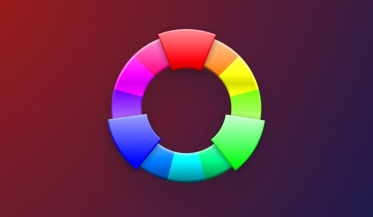
Colour is doing far more work in your designs than you think. The science and psychology behind it, so every hue on the page earns its place.
Design systems sound like bureaucracy and turn out to be freedom. Why structure is the thing that lets a team actually create something.
A tour of type: where it came from, the vocabulary nobody bothers to explain, and the hierarchy, alignment and contrast that make letters behave.
Balance, movement, emphasis, and the rest of the rules. Learn them properly, use them until they are instinct, then start breaking them on purpose.